Mastering Data Visualisation with Power BI
Data visualisation is more than just presenting data; it's about telling a story that can influence decision-making, highlight trends, and drive action. In the realm of data-driven decision-making, the ability to transform raw data into compelling visuals is paramount. Power BI, Microsoft's flagship business intelligence tool, empowers users to craft interactive dashboards and reports that tell stories hidden within datasets. If you're new to Power BI and eager to unlock its potential, this guide offers essential tips and techniques to embark on your data visualisation journey.
Understanding the Power of Visuals
Before diving into the technicalities, let's acknowledge the profound impact of data visualisation. Visual representations tap into our innate ability to process information quickly and intuitively. Visualisation allows complex data to be understood quickly and easily. According to a study by MIT, the human brain can process images in as little as 13 milliseconds, making visualisation a powerful way to communicate insights effectively. With Power BI, you can transform raw data into compelling visuals that not only represent data accurately but also drive strategic decision-making.

Getting Started with Power BI
Power BI’s user-friendly interface makes it accessible for beginners. Here’s how you can get started:
Installation and set-up:
Begin by downloading Power BI Desktop, the free application you’ll use to create reports. Take some time to explore the interface—familiarise yourself with the ribbons, panes, and the overall layout. The canvas, where you'll design your reports, is flanked by the Fields pane (listing data sources) and the Visualizations pane (offering various chart types).
Connect to data sources:
Power BI allows you to connect to various data sources, including Excel files, SQL databases, cloud services, and even web-based data. Start by connecting to a simple data source to practice importing data; select "Get Data" to initiate the connection process and import your chosen dataset. Remember your visualisations will only be as good as the data you feed into the tool!
Data cleaning & transformation:
Rarely is data perfect upon import. Power BI’s Power Query Editor allows you to perform various data transformation tasks like filtering rows, removing duplicates, and creating calculated columns. Understanding how to manipulate data in Power Query is vital for ensuring your visualisations are accurate, consistent and meaningful.
Tips for effective visuals:
Creating effective data visualisations involves more than just dragging and dropping data fields onto a canvas:
-
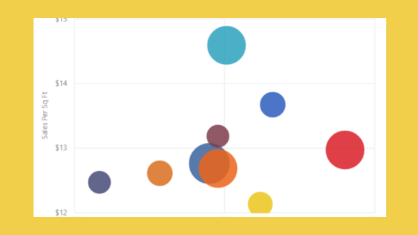
Choosing the Right Chart: The type of visualisation you select depends on the nature of your data and the message you aim to convey. Bar and column charts excel at comparisons, line charts track trends over time, pie charts and donut charts illustrate proportions, and scatter plots reveal relationships between variables.
-
Simplicity is Key: Avoid using overly complex charts that might confuse the viewer. Simplicity often leads to clearer communication. Focus on the most critical insights and eliminate clutter. Clear labels, concise titles, and thoughtful use of colour enhance comprehension.
-
Storytelling: Think of your dashboard as a narrative. Guide viewers through your data with a logical flow, starting with high-level summaries and progressing to granular details. Annotations and callouts can highlight key takeaways.
Essential Visualisation Techniques
Utilise slicers & filters:
One of Power BI's strengths is its interactivity. Leverage features like filters, slicers, and drill-throughs to enable users to explore data on their terms. This empowers them to uncover deeper insights and answer their own questions.
Master DAX for calculations:
Data Analysis Expressions (DAX) is a formula language in Power BI used to perform calculations on your data. Learning the basics of DAX will allow you to create calculated fields, measures, and columns that can add significant value to your visualisations. Start with functions like SUM, AVERAGE, and COUNT, and gradually explore more advanced functions like CALCULATE and FILTER.
Leverage Power BI’s custom visuals:
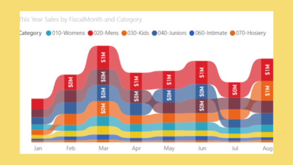
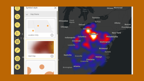
Power BI offers a range of custom visuals through its marketplace. These visuals can enhance your reports by offering more ways to represent data, such as heat maps, word clouds, and bullet charts. Explore the marketplace to find visuals that best suit your data and objectives.
Taking Your Skills Further
Online communities and forums:
Connect with fellow Power BI enthusiasts to exchange ideas, seek advice, and stay abreast of the latest developments; Microsoft provides comprehensive documentation and tutorials on Power BI, covering everything from basic concepts to advanced features.
Formal training:
To fast-track your skills in Power BI, consider enrolling in a structured Power BI course. There are training courses for every level, where experts guide you through practical exercises and relevant examples for your business, to ensure you gain the skills that you need. Power BI is key to business intelligence across all sectors, so there's a wide variety of Microsoft-certified courses that begin with the fundamentals, concentrate on data analysis expressions (DAX), and guide you through advanced Power BI features. There's also specific training available for Power BI professionals to support you in becoming an accredited Microsoft Certified Data Analyst Professional.
Common Pitfalls to Avoid
As you develop your Power BI skills, it’s important to be aware of common pitfalls that can undermine your visualisations:
-
Chart Junk: Avoid decorative elements that don't contribute to understanding. Gridlines, 3D effects, and unnecessary background images can distract from the core message.
-
Data Overload: Cramming too much information into a single visual creates confusion. Break down complex data into multiple charts or consider using interactive elements to reveal details progressively.
-
Misleading Scales: Truncated axes or inconsistent scales can distort data and lead to misinterpretations. Ensure scales are accurate and representative.
-
Ignoring the Importance of Layout and Design: A well-designed report is easier to navigate and understand. Pay attention to the layout, use consistent colour schemes, and ensure that your visuals are aligned properly. White space is your friend; it helps to reduce clutter and improve readability.
-
Neglecting Data Refresh and Accuracy: Always ensure that your data is up-to-date. Power BI allows you to schedule data refreshes, ensuring that your reports are always reflecting the latest information. Inaccurate or outdated data can lead to incorrect insights, which can be detrimental to decision-making.
-
Ignoring Accessibility: Design visuals with accessibility in mind. Use sufficient colour contrast, provide alternative text for images, and consider keyboard navigation for users with disabilities.
Mastering Power BI
Mastering data visualisation with Power BI is a rewarding endeavour. By applying these tips and techniques, you can transform raw data into insightful visuals that inform, engage, and inspire action. Start with the basics and gradually explore and whether you're a business analyst, marketer, or simply someone passionate about data, Power BI is a tool that can amplify your impact.
Remember, the key lies in continuous learning and practice. Embrace experimentation, explore new features, and seek inspiration from the Power BI community or training providers. As you hone your skills, you'll unlock the full potential of data visualisation and empower yourself to make informed decisions in an increasingly data-driven world.


